Mastering Website Navigation: A Comprehensive Guide
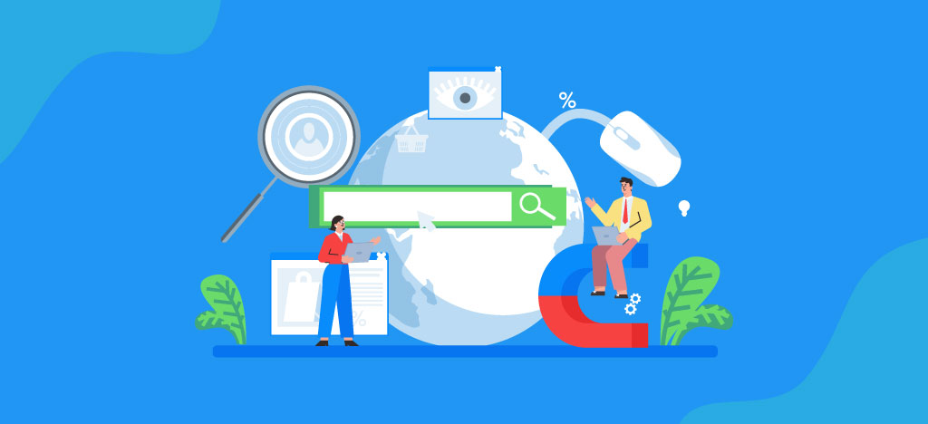
Website navigation is a critical component in the design and functionality of any site. It refers to the system that allows users to easily move through the various sections and pages of a website. Effective website navigation enhances the user experience to navigate targets and plays a significant role in search engine optimization (SEO).
From an SEO perspective, good navigation helps search engines understand the hierarchy and importance of your content. This understanding is crucial for indexing and ranking your pages appropriately.
Mastering Website Navigation
A well-structured web page navigation system ensures that visitors can quickly find the information they seek on the website toolbars. It reduces frustration and increases engagement. Poor navigation, on the other hand, can lead to higher bounce rates and lower conversion rates.
This guide will walk you through mastering website navigation for improved usability and search rankings. Topics covered include:
- Different types of navigation bar examples.
- The role of good navigation SEO in user experience.
- How navigation affects visitor behavior and conversions.
- Designing seamless user journeys.
- Staying updated with modern web design trends.
By applying these strategies, you’ll be able to create a more intuitive and efficient navigation system that benefits both users and search engines.
Types of Website Navigation
Website navigation is the backbone of any site’s user experience. Different types of navigation interfaces cater to various needs and preferences, each with its unique advantages and disadvantages.
Horizontal Navigation Bar
A horizontal navigation bar is a classic choice for many websites. Typically located at the top of a webpage, it provides easy access to the main sections of a site.
Pros:
- Visibility: Always in sight, making it easy for users to find.
- Simplicity: Straightforward design that users are familiar with.
- Space-saving: It doesn’t take up much vertical space on the page.
Cons:
- Limited Room: This can become cluttered if too many items are included.
- Responsiveness Issues: It might not translate well to smaller screens without adjustments.
Dropdown Navigation Menu
The dropdown navigation menu extends from a horizontal or vertical menu when an item is clicked or hovered over. It offers a way to include more options without overwhelming the main interface.
Pros:
- Compact: Saves space by hiding additional links until needed.
- Organized: Can group related items under one heading.
- User-friendly: Users can drill down into categories without leaving the main page.
Cons:
- Accessibility: Can be challenging for users with certain disabilities or those using screen readers.
- Complexity: Overuse can lead to confusion if too many nested levels are included.
Hamburger Navigation Menu
The hamburger navigation menu, typically represented by three horizontal lines, is popular in mobile design but also used in desktop interfaces.
Pros:
- Minimalist Design: Keeps the layout clean and uncluttered.
- Mobile-friendly: Excellent for responsive designs as it adapts well to smaller screens.
- Focus on Content: Allows the main content to take center stage without distraction.
Cons:
- Discoverability Issues: Some users may not recognize the icon or understand its function immediately.
- Extra Step: Requires an additional click or tap to access the menu items.
Vertical Sidebar Navigation Menu
A vertical sidebar navigation menu runs along the side of a webpage, either on the left or right. This type is useful for a site web menu with numerous categories or sections.
Pros:
- Capacity: Can handle a large number of links without looking cluttered.
- Persistence: Often remains fixed while users scroll through content, providing constant access.
- Hierarchy Display: Clearly shows subcategories and nested items.
Cons:
- Screen Real Estate: Takes up significant horizontal space, which might be problematic on smaller screens.
- Distraction Potential: This may draw attention away from primary content if not designed carefully.
Footer Navigation Menu
The footer navigation menu, found at the bottom of a webpage, often includes secondary links such as privacy policies, terms of service, and contact information.
Pros:
- Secondary Access Point: Provides an alternative location for important yet non-primary links.
- SEO Benefits: Additional internal links at the footer can help search engines crawl your site more effectively.
- User Expectation: Many users instinctively look at footers for specific information like contact details or legal notices.
Cons:
- Visibility Issues: Less visible since users need to scroll down to see it.
- Overlooked Links: Users might miss important links if they don’t reach the bottom of the page regularly.
Understanding these different types of site navigation and their respective pros and cons helps you choose the best fit for your site’s structure and user base. Choosing wisely can enhance usability and keep visitors engaged.
The Role of Good Website Navigation in User Experience and SEO
When it comes to website optimization, effective navigation design is crucial. Good website navigation acts as a guide to navigating an internet resource for users, helping them navigate your content smoothly. It ensures that visitors can quickly and easily find what they’re looking for, which greatly improves their experience. If you are an entrepreneur and want your website to get navigated effectively, then choose Imark Infotech for the best website optimization and navigation services.
User Experience (UX):
- Ease of Use: A well-designed navigation system makes a website easy to use. Visitors should be able to find pages or information without having to think too much or click through multiple layers.
- Engagement: When users can navigate a site with ease, they’re more likely to interact with its content. This leads to longer time spent on the site, lower bounce rates, and a more satisfying experience.
- Accessibility: Clear navigation ensures that all users, including those with disabilities, can access your content. Using accessible web design practices like ARIA roles and keyboard-friendly navigation can make a big difference.
Search Engine Optimization (SEO):
Good website navigation also has a significant impact on SEO. Search engines like Google use crawlers to index the content of your site. Effective navigation helps these crawlers understand how your site is structured, which can positively affect your search rankings.
- Crawlability: Well-organized navigation helps search engine bots crawl and index your site more efficiently. This includes having a consistent internal linking structure.
- Keyword Optimization: Navigation menus that include relevant SEO keywords can help improve your site’s visibility on search engine results pages (SERPs). Using descriptive anchor text for links is important.
- User Behavior Metrics: Factors such as time spent on the page and bounce rate, both influenced by how easily users navigate your site, are also taken into account by search algorithms. Better UX directly translates into better SEO performance.
Examples of Website Navigation Best Practices
Implementing best practices in website navigation design can significantly improve both user satisfaction and your site’s SEO performance. Here are some of the best website navigation examples:
- Consistency: Ensure that navigation elements are consistent across all pages. This includes maintaining the same placement, labels, and styles for your menus.
- Clear Labels: Use clear, concise labels for menu items that accurately describe the linked content. Avoid using jargon or technical terms unless your audience is familiar with them.
- Logical Hierarchy: Organize your content in a logical hierarchy so that related items are grouped together.
For example:
- The main categories should cover broad topics.
- Subcategories should delve into more specific aspects of those topics.
- Responsive Design: Since a significant amount of web traffic comes from mobile devices, make sure your navigation is responsive. Implement designs like hamburger menus or collapsible sections for smaller screens.
- Internal Linking: Use internal links within your content to guide readers to related articles or sections of your site. This not only improves UX but also boosts SEO by distributing link authority throughout the site.
- Search Functionality: Incorporate a powerful search feature that allows users to quickly find specific content if they can’t locate it through the main navigation.
Different Levels of Web Navigation
Website navigation can be categorized into three key levels: global navigation, hierarchical navigation, and local navigation. Understanding these levels is essential for creating an intuitive and effective user experience.
Global Navigation
Global navigation refers to the elements that remain consistent across every page of a website. This type of website navigation bar design typically includes the main menu and links to primary sections such as Home, About Us, Services, Contact, and Blog.
Pros:
- Consistency: Users can easily navigate back to key pages no matter where they are on the site menu design.
- Accessibility: Important information is always at the user’s fingertips.
Example: Consider an example of a site of The New York Times. The global web navigation bar at the top includes links to major sections like News, Opinion, and Sports. This ensures users can quickly access different areas without needing to return to the homepage.
Hierarchical Navigation
Hierarchical navigation changes based on the context of the current page. It structures content in a way that reflects its importance and relationship to other information on the site.
Pros:
- Contextual Relevance: Helps users understand their location within the site’s structure.
- Scalability: Suitable for large websites with multiple layers of content.
Example: An e-commerce site like Amazon uses hierarchical navigation effectively. When browsing Electronics, subcategories like Mobile Phones, Laptops, and Cameras appear, helping users drill down to specific products.
Local Navigation
Local navigation refers to internal links within specific sections or pages. These links help users explore related content without leaving their current context.
Pros:
- Focused Exploration: Encourages users to delve deeper into related topics.
- Enhanced Engagement: Keeps users within a particular section longer by offering relevant content.
Designing a Seamless User Journey Through Effective Website Navigation
Creating an intuitive and user-friendly website navigation system requires careful planning and a focus on key principles. By understanding these principles, you can design a navigation system that enhances the user experience and boosts your site’s SEO performance.
Essential Principles for Designing an Intuitive and User-Friendly Website Navigation System
1. Planning Page Structure and Navigation
A well-organized page structure is the foundation of effective website navigation. Start by mapping out your site’s hierarchy:
- Main Categories: Identify the primary sections of your website (e.g., Home, About, Services, Blog, Contact).
- Subcategories: Break down each main category into relevant subcategories.
- Content Pages: Determine which pages belong under each subcategory.
Using tools like wireframes or site maps can help visualize this structure. A clear hierarchy ensures users can easily find the information they need without feeling overwhelmed.
2. Using Users’ Vocabulary and SEO Keywords
To create intuitive navigation, use terms familiar to your audience. Conduct keyword research to identify the phrases your target users are searching for. Incorporating these keywords into your navigation labels not only aids usability but also enhances SEO.
Example: If you’re running an e-commerce site selling electronics, instead of using vague labels like “Shop,” use specific terms like “Laptops,” “Smartphones,” or “Accessories.”
3. Implementing Responsive Menus
With mobile devices accounting for a significant portion of web traffic, responsive design is crucial. Ensure your navigation menus adapt seamlessly to different screen sizes:
- Hamburger Menus: For mobile devices, consider using hamburger menus that expand when tapped.
- Collapsible Sections: On smaller screens, use collapsible sections to keep the navigation clean and accessible.
- Touch-friendly Design: Buttons and links should be large enough to be easily tapped without accidental clicks.
Responsive menus enhance the user experience by providing consistent accessibility across all devices.
Practical Tips for Effective Navigation Design
1. Consistency in Design
Maintain consistency in your navigation design across all pages:
- Uniform Layouts: Use the same layout and design elements for navigation bars on every page.
- Consistent Styling: Ensure that fonts, colors, and button styles remain consistent throughout the site.
Consistency helps users build familiarity with your site’s structure, making it easier to navigate.
2. Clarity and Simplicity
Avoid cluttered navigation menus that can confuse users. Keep it simple:
- Limit Main Menu Items: Stick to 5-7 main menu items to prevent overwhelming choices.
- Descriptive Labels: Use clear, descriptive labels that convey what users will find on each page.
A simple and clear navigation menu reduces cognitive load and guides users smoothly through their journey.
3. Visual Hierarchy
Use visual cues to establish a hierarchy in your navigation:
- Highlight Active Links: Indicate which page is currently active by highlighting the corresponding menu item.
- Dropdown Menus: Use dropdown menus to reveal subcategories without cluttering the main menu.
Keeping Up With Modern Web Design Trends in Website Navigation
In the ever-changing world of web design, it’s important to stay updated on the latest trends. This is especially true when it comes to website navigation. New trends and innovations can have a big impact on how users experience your site, so it’s crucial to keep up with them.
Here are some key trends in web design that are currently shaping website navigation:
1. Minimalistic Design
Minimalism is a popular trend in web design right now. It focuses on simplicity and removing unnecessary elements. When it comes to navigation, this means:
- Hamburger Menus: These are commonly used in mobile apps and responsive websites. They hide the navigation links under an icon, making the interface cleaner.
- Single-Level Menus: Instead of having multiple levels of dropdown menus, some sites are opting for single-level navigation. This makes it easier for users to find what they’re looking for without having to navigate through multiple layers.
2. Microinteractions
Microinteractions are small animations or responses that happen when users interact with certain elements on a website. They can enhance the user experience by providing feedback or guiding actions. Examples of microinteractions in navigation design include:
- Hover Effects: When users hover over a menu item, it can change color or display additional information. This visual cue helps users understand that the item is interactive.
- Loading Indicators: If there’s a delay in loading a page or content, using a loading animation can help manage user expectations and reduce frustration.
3. Voice User Interface (VUI)
With the rise of voice assistants and voice search, integrating voice commands into website navigation is becoming more important. This allows users to navigate your site hands-free, which can be especially useful for people with disabilities or those using mobile devices.
4. Progressive Disclosure
Progressive disclosure is a design technique where information is revealed gradually. In the context of navigation, this means showing only the most important links upfront and hiding secondary options until they’re needed. This helps reduce cognitive load and keeps the interface clean and focused.
5. Mobile-First Design
As more people use their smartphones to browse the internet, it’s essential to prioritize mobile-friendly design. This includes:
- Thumb-Friendly Navigation: Placing important navigation elements within easy reach of the user’s thumb for one-handed use.
- Collapsible Menus: Using expandable sections or accordion-style menus to save screen space while still providing access to all navigation options.
6. Personalization
Personalized navigation tailors the user experience based on individual preferences and behavior. This can include:
- Dynamic Menus: Showing menu items based on a user’s past interactions or frequently visited pages.
- Content Recommendations: Suggesting relevant content based on a user’s browsing history or interests.
7. Accessibility
Making sure your website is accessible to all users, including those with disabilities, is not just a trend but a requirement. Some accessibility features to consider for your navigation:
- Keyboard Navigation: Allowing users to navigate through your site using keyboard shortcuts, which is especially important for people with mobility impairments.
- Screen Reader Compatibility: Ensuring that your menus are properly labeled and structured using semantic HTML and ARIA roles, so they can be understood by screen reader software.
8. Visual Hierarchy
Visual hierarchy refers to the arrangement and presentation of elements in a way that guides users’ attention. In terms of navigation, this involves:
- Contrasting Colors: Using colors that stand out from the rest of the page for primary navigation items, making them more noticeable.
- Whitespace Utilization: Adding enough whitespace (empty space) around navigation elements to create separation and improve readability.
By staying informed about these trends and incorporating them into your web design strategy, you can ensure that your website navigation remains modern, user-friendly, and effective in achieving both user satisfaction and business objectives.
Conclusion
Mastering website navigation is crucial for creating an engaging and user-friendly online experience. The strategies and techniques discussed in this guide, from understanding different types of navigation like breadcrumb menus, hamburger menus, tabs navigation, and mega menus, to designing intuitive user journeys, offer valuable insights for enhancing your site’s usability and search engine performance.